• Log In
  • Log In
Slate (skeleton-v3 PHP 8 prototype)
Slate (skeleton-v3 PHP 8 prototype) Learn · Create · Lead
  • Students
    • Mission and Vision
  • Parents
  • Community
    • Mission and Vision
  • Calendar

Globalization - Laufenberg Public Feed

Create a Post

World of 100 Analysis

Posted by Ian McClendon in Globalization - Laufenberg on Saturday, February 11, 2012 at 12:38 am

​For a class of at least 32-34 students we had to deiced what the rest of the world would be like if there were only 100 people. The sheet of paper that we had to give our estimations on included a lot of possibilities and diverse features of civilization. So each student wrote down their estimation of how the World of 100 would stack up. After words when the whole class put down their responses they were totaled and averaged. To sum all of it we referred to actual data that represented the World if only 100 people lived. Next was to compare everything from My Average, Class Average, and the Correct Averages. On the paper there were 12 topics from the ratios of Gender, Education, to Religion. I picked 3 of the topics that was most interesting to me even before we looked at the class average or the correct average. So I choose Geography, Age, and Electricity. (results displayed below)
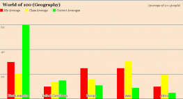
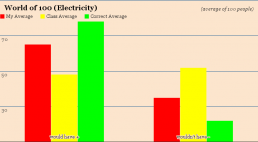
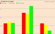
chart_4 (2)

chart_6


chart_5 (1)

-------------------------------------------------------------------------------------------------------------------------------

(click for full size)
chart_4 (2)
chart_4 (2)
chart_5
chart_5
chart_6
chart_6
Be the first to comment.

World of 100 Analysis

Posted by Marina Stuart in Globalization - Laufenberg on Friday, February 10, 2012 at 1:36 pm

​
In this graphic, we are seeing how many people would have good or bad drinking water. What stands out is that in reality only 13 people would have improvised water instead of the 50 or so that myself and the class thought.


This graphic is about how many people would get secondary education. It seems that I did not give enough credit to the general people because my estimates were way off of those of the researchers. The class is seems was also off but not to the extent I was. Despite all the news about uneducated children in other counties The amount of people in the world with education is much larger with those without. In fact it is a kind of comforting notion.

This last graphic is about literacy by gender. In this one again both myself and the class were off in our estimates but the fact is that many people in the world do know how to read and we underestimated them. I think that truly we do not give enough credit to people in other countries, these numbers show that a significant percentage of the world can read.

Overall, between my answers and the correct ones I was not very close with my estimations. The ones I was closet on were religion, gender, and technology.  One catagory that surprised me was that the gender division would be 50/50. I didn't think the world was that even. I think the reason I was so off with my prediction is I don't think I have a complete understanding of the world and I need to understand other countries more. I think I have a very media skewed view, where most of my information comes from how other countries are perceived and not from actual fact. 
Be the first to comment.

World of 100 Ananlysis

Posted by Anonymous in Globalization - Laufenberg on Friday, February 10, 2012 at 1:35 pm


In this graphic, we are seeing how many people would have good or bad drinking water. What stands out is that in reality only 13 people would have improvised water instead of the 50 or so that myself and the class thought.


This graphic is about how many people would get secondary education. It seems that I did not give enough credit to the general people because my estimates were way off of those of the researchers. The class is seems was also off but not to the extent I was. Despite all the news about uneducated children in other counties The amount of people in the world with education is much larger with those without. In fact it is a kind of comforting notion.

This last graphic is about literacy by gender. In this one again both myself and the class were off in our estimates but the fact is that many people in the world do know how to read and we underestimated them. I think that truly we do not give enough credit to people in other countries, these numbers show that a significant percentage of the world can read.

Overall, between my answers and the correct ones I was not very close with my estimations. The ones I was closet on were religion, gender, and technology.  One catagory that surprised me was that the gender division would be 50/50. I didn't think the world was that even. I think the reason I was so off with my prediction is I don't think I have a complete understanding of the world and I need to understand other countries more. I think I have a very media skewed view, where most of my information comes from how other countries are perceived and not from actual fact. 

Be the first to comment.

World of 100 Ali Ahmed

Posted by Ali Ahmed in Globalization - Laufenberg on Friday, February 10, 2012 at 12:29 pm

​Ali Ahmed

Poverty of 100
Screen Shot 2012-02-10 at 1.18.27 PM
The graph above is a representation of my guess, m classes average guess and the actual answer of how many people live in poverty (less than 2usd/day). I held a much more realistic view than the res of my class in the statistic. I know that the unfortunate are a dominant amount of people but I know that our world has moved in the direction where labor in general is needed more and more and even if they are not getting paid much, 2 dollars isn't much at all. The statistic is still staggering. 48% of people in poverty is still a horrible statistic and is suprising for our day in age.   

Screen Shot 2012-02-10 at 1.17.48 PM  
One statistic that I felt really confident about was drinking water. I know that there have been huge leaps in cheap humanitarian alternatives to drinking water. What I did not expect was the huge leaps in such advancements. To achieve such a record is amazing, The class were pessimist with these statistics I guess I expect more of the world community.

Screen Shot 2012-02-10 at 1.21.04 PM

As with the water statistic this one suprised me similiarly. I knew electricty has become much more accesible but advances have become surprising, and as with the water statistic the class was full of pessimists. We are getting to a point where things we take for granted are being taken for granted elsewhere and this creates an illusion that we live the same. Just because you have electricity doesn't means it's on 24 hours a day nor do you have the supplies to actually use it. These statistics are skewed as are all stats but I like that these stats can even be justified. This wasn't possible ten years ago. Maybe in ten years there stats will be real.


Be the first to comment.

World of 100 Analysis

Posted by Andre Reed in Globalization - Laufenberg on Friday, February 10, 2012 at 12:28 pm

<script type="text
/javascript" src="//ajax.googleapis.com/ajax/static/modules/gviz/1.0/chart.js"> {"dataSourceUrl":"//docs.google.com/a/scienceleadership.org/spreadsheet/tq?key=0Ampys0iavQBCdGl2Z3JWcDRGNmxmT2FxSzNmTXFwOUE&transpose=0&headers=0&range=A2%3AB3&gid=0&pub=1","options":{"vAxes":[{"title":null,"minValue":null,"viewWindowMode":"pretty","viewWindow":{"min":null,"max":null},"maxValue":null},{"viewWindowMode":"pretty","viewWindow":{}}],"booleanRole":"certainty","animation":{"duration":500},"vAxis":{"format":""},"useFirstColumnAsDomain":true,"hAxis":{"maxAlternations":1,"format":""},"isStacked":false,"width":243,"height":371},"state":{},"view":["{\"columns\":[0,1]}","{\"columns\":[0,1]}","{\"columns\":[0,1]}"],"chartType":"ColumnChart","chartName":"Chart 1"} </script>
<script type="text/javascript" src="//ajax.googleapis.com/ajax/static/modules/gviz/1.0/chart.js"> {"dataSourceUrl":"//docs.google.com/a/scienceleadership.org/spreadsheet/tq?key=0Ampys0iavQBCdGl2Z3JWcDRGNmxmT2FxSzNmTXFwOUE&transpose=0&headers=0&range=A5%3AB7&gid=0&pub=1","options":{"vAxes":[{"title":null,"minValue":null,"viewWindowMode":"pretty","viewWindow":{"min":null,"max":null},"maxValue":null},{"viewWindowMode":"pretty","viewWindow":{}}],"booleanRole":"certainty","animation":{"duration":500},"vAxis":{"format":""},"useFirstColumnAsDomain":true,"hAxis":{"maxAlternations":1,"format":""},"isStacked":false,"width":248,"height":371},"state":{},"view":["{\"columns\":[0,1]}","{\"columns\":[0,1]}","{\"columns\":[0,1]}"],"chartType":"ColumnChart","chartName":"Chart 2"} </script>
Be the first to comment.

World of 100

Posted by Ayanna Robinson in Globalization - Laufenberg on Friday, February 10, 2012 at 12:27 pm


The sections I was most accurate in were the “owning vs. not owning a computer” and age categories. For the age I think I was accurate because the age division seems to be the same almost anywhere you look. In every statistical set of data you’ll find that the age separations are pretty consistent. Because of this, I recognized seeing the numbers fairly often and used memory to take my guess. For the technology section, I simply assumed/knew most people in the world didn’t have access to a computer like we do at SLA. I picked the simplest ratio (90 to 10) and that was close enough to the real answer (88 to 12).

I didn’t get much right but I think the incorrect guess that was most surprising was the gender and drinking water categories. Usually when I look at schools, there's more girls than boys in a class. That has been mostly true for me since first grade. Seeing that we’re actually split right down the middle shocked me because I had never seen that ratio before. The drinking water was a shock because in lower school we did an assignment and found that only about 3% of the water in the world was drinkable. Because I this I assumed that there would be more people without water than with it and not the other way around.


My predictions weren’t split evenly but there was enough in the right category (in my opinion). I think this is because the city of Philadelphia doesn’t give me an accurate outlook on the world. Philadelphia and SLA project statistics and ratios that are much different from the actual world. If someone only saw one type of people wherever they went they would think the entire world was filled with those types of people, that's what SLA and Philadelphia have done to me. In some aspects they're an accurate portrayal of the word but in most aspects they're not.  


Be the first to comment.

World of 100

Posted by Kashif Ahmad in Globalization - Laufenberg on Friday, February 10, 2012 at 12:26 pm

Technology

For one of the graphs, I chose to do the one with the technology. For the world of 100, when it came to pick how many people would have cell phones and how many wouldn't, I went off from the current time right now. Now days 9 out of 10 people has a cell phone so therefore I chose that 70% would have cell phones and 30% wouldn't. 


Male Literacy
For the male literacy, I wanted to chose something that's different from this world. For instance it is common for someone to say that men are lazy or illiterate. That's why I chose more men that could read and write then men that couldn't. I chose that because if there was a world with more men not knowing how to read and write then that world would be at risk because it would have a lot of illiterate people. 

Poverty

For the poverty part I chose that more people would live on than 2 dollar a day then people that would live on less than 2 dollar a day. I hate seeing people who struggles everyday just to get what they want that's why I chose more people would live on more than 2 dollar a day because they would have jobs and it would be easier for them to buy their personal needs. Also there would be some poor people but more rich people then poor so the rich people can help the poor ones and that will increase the love they would have for each other. 
Be the first to comment.

Kessler World of 100 Analysis

Posted by Jeffrey Kessler in Globalization - Laufenberg on Friday, February 10, 2012 at 12:20 pm

World of 100 Statistics
This chart shows how many people would speak a variety of languages if the world were only 100 people (with the same percentages as the current world). Most interestingly, there is a high amount of "other" languages spoken in the world.
World of 100 Statistics 2
​This chart, using the same "world of 100" methodology, describes the world's cell phone usage. Notably, my guess for internet users was nearly spot-on, whereas it was greatly exaggerated by the rest of the class. In addition, it was interesting to see how the class viewed technology in terms of internet users being almost equivalent to cell phone subscribers.
World of 100 Statistics 3
​This chart used the world of 100 method to compare religions. While I overstated the first two, it is rather interesting to see how accurate the class average came to the real number. Had my first two not been exaggerated, my results for the rest would've most likely been in line with the class and real results.

Overall, the answer for which I was most accurate was internet usage (where my guess was overestimated by only one person). This is most likely due to my technological experience and understanding of the internet. The answers for which I was least accurate were with literacy and electricity. I underestimated the percentage of households with electricity and similarly did so with education. The best attribution for such a result is that I have seen many activist programs for increasing overall literacy and technology access across the world; this caused me to over-emphasize these issues. The answer for which I was most shocked was that 75% of the world currently subscribes to a cell phone. This was most interesting as many other values for technology access are much lower. Thus, cell phones have become so widespread that they are a great way of expanding communication and internet access across the world.

Be the first to comment.

World of 100 Analysis

Posted by Emma Hersh in Globalization - Laufenberg on Friday, February 10, 2012 at 12:16 pm

Religion
I was closest with muslim, other and non-religious, which was not all that surprising because I was fairly certain that a large chunk of the 100 would affiliate with the Muslim religion given all of the Middle-Eastern demographics. I was, however, not expecting to be so far off with Buddhist and Christian. In my mind those are the fairly equal because of the number of countries that might believe them as a main religion.

Screen Shot 2012-02-09 at 10.25.16 AM

Language
The most interesting part of this one was the number of people who spoke other languages, I always knew that there were other languages but I was unaware of just how many and how prominent they were in the world. I was surprised by how few spoke Arabic and Chinese (even though Chinese still had a higher number across the board) because I thought those were spoken more widely. If fewer languages were in Other, it definitely wouldn't have been as high. I was also surprised by how many points Malay-Indonesia and how few English got. English because though only a few countries speak it as the main language, I thought many spoke it as a secondary language. language

Geography
As far as geography goes, I should have thought more ahead of the amount of people in Asia and how few people live in North America given that North America is basically only two countries and Asia has a huge amount with some of the most populated cities in the world. Given that thought process though, I was counting on Latin America because of the highly populated cities. I was most surprised by the amount of people who live in North America because it seems like one of the main places people immigrate to from other countries.geography


Analysis of Total
I was surprisingly close with certain parts of technology, for instance the amount of people who own computers (22) and are internet users (30) were spot on. With that said, I went into those with a fairly cynical view of the world. Thinking of the amount of people who I've met in various countries all use the internet, though they might not own a computer necessarily. I understood that a lot of the world is impoverished, but didn't realize until the answers came back what it means to be privileged in certain countries versus others. Given these views, I was really surprised at how far away I was from guessing the poverty in the world. The question was how many people live on more than 2 U.S dollars per day (52) and how many live on less (48). Though I'm relieved (and at the same time disturbed) that it's about half and half, I understand that 2 U.S dollars per day is almost nothing the United States. It's almost a forth of minimus wage per hour in this country, which is really not enough to live off of. Most people in our school spend more than 2 dollars on food every day.
Another category I was interested in was Urban and Rural dwellers. My guess was 70 would be urban dwellers and 30 rural; however, I was off again. The real statistics are urban 51 and rural 49. This caught me by surprise. I thought because cities are such a huge market for jobs and international affairs they would be more populated with people who live, work, and raise a family there. That the amount of people living in rural areas would be fewer because of fewer job opportunities and because of generally fewer people to more land, whereas cities tend to be the opposite. 

When tallying the amount of people per category, I realized that I just don't know much about the living environments, income, death rates, form of government, etc of those in the surrounding countries. 
Be the first to comment.

World of 100

Posted by Shelby Harcher in Globalization - Laufenberg on Friday, February 10, 2012 at 11:38 am

Shelby Harcher


When looking through the data that the class came up with, the actual averages and my own, I was pretty shocked. When doing this survey, I tried to keep in mind that not all countries are like America but also not all are the complete opposite either. When it came to the question "Those who do not have access to clean drinking water." and "Those who have access to drinking water." it took me awhile to come up with percentages. At first, I wanted to give a high percentage to those who do have access to clean water, but then I remembered that come countries/places do not, so I lowered my percentage.

Screen Shot 2012-02-10 at 11.58.12 AM

After comparing my percentages to the classes, I thought "okay, well we're pretty much on the same page." Once i saw how low the percentage was for those who do not have access to drinking water, I was shocked. I expected it to be higher, but then I was glad because the percentage I had was high. Not only were my percentages high for this graph, but I placed a high percentage for males who would have a secondary education.
Screen Shot 2012-02-10 at 11.58.25 AM


From my understanding, most people complete high school. I didn't have knowledge for those who were in other countries, but I assumed that more people would attend school than not. When I looked at the class average, mine was higher. Once I looked at the actual averages I was confused. The real average is much higher than the class' average and as well as my own. About 65% of males do not attend secondary education, which is shocking. However, once I went on to look at my next graph (poverty) it made sense as to why the numbers come out the way they do .

I said that more people lived on more than $2 a day than those who lived on less than $2 a day. 2 dollars isn't much and yearly, it comes out to about $730. In the United States this is beyond poor.

Screen Shot 2012-02-10 at 11.58.42 AM


When looking at the class average, it was split close to the middle as usual. But when looking at the real averages, it was almost split down the middle between the two as well. I didn't expect for that to happen, but when I realized how much poverty there is, it made more sense as to why the secondary education averages came out to how they did .

For my graphs, I wasn't really accurate for any of them but the closest one was for poverty. Most of my knowledge is off of what I experience in my country besides things I've seen in movies or hear about. As mention ed, the graph for secondary education shocked me the most because I just assumed that most people went to high school, but once seeing the poverty it made sense. Not knowing about other places and countries threw me off and I was just going by what I experience myself and things I've heard.
Be the first to comment.
96 posts:
← Prev
  1. 1
  2. 2
  3. 3
  4. 4
  5. 5
  6. 6
  7. 7
  8. 8
  9. 9
  10. 10
Next →
RSS

GLOBAL-004

Term
2011-12.S2

Blog Tags

  • globalization 5
  • William 2
  • Marsh 2
  • Philadelphia 1
  • Lauf 1
See all See less
  • Essay
  • Q3
  • 2012
  • Joshua Martin-Corrales
  • Etheredge
  • Senior
  • Photo
  • Burma
  • Myanmar
  • Ali
  • Ahmed
  • Joshua
  • Martin-Coralles

Teacher

  • Diana Laufenberg
Slate (skeleton-v3 PHP 8 prototype) · Location: 1482 Green St · Shipping: 550 N. Broad St Suite 202 · Philadelphia, PA 19130 · (215) 400-7830 (phone)
×

Log In