
American History - Laufenberg Public Feed
Gulf of Mexico Dead Zone
Kingston, TN Coal Ash Spill: Infographic
a. What went well?
-I think my group's whole process went really well, we all split up the project equally, shared our finding, and helped each other with the different topics as well. And our finished product is also really cool and informative.
b. What did not?
- There really isn't anything that didn't work out well, I think we made our point and we made some good comparisons so people could really understand how big this disaster was. We completed everything that was needed to and the whole process was actually really smooth.
c. What would you do differently next time?
- I might possibly use a different way to visualize the disaster, instead of a slide with words and pictures maybe find another way to express what happened. Maybe even something more creative.
d. Specifically comment on the 10 tips for effective infographics -
-I think my group's whole process went really well, we all split up the project equally, shared our finding, and helped each other with the different topics as well. And our finished product is also really cool and informative.
b. What did not?
- There really isn't anything that didn't work out well, I think we made our point and we made some good comparisons so people could really understand how big this disaster was. We completed everything that was needed to and the whole process was actually really smooth.
c. What would you do differently next time?
- I might possibly use a different way to visualize the disaster, instead of a slide with words and pictures maybe find another way to express what happened. Maybe even something more creative.
d. Specifically comment on the 10 tips for effective infographics -
Be Concise
Be Visual
Be Smarter
Be Transparent
Be Different
Be Accurate
Be Attractive
Be Varied
Be Gracious
Be Creative
Infographic - Markia, Ayanna, and Sam S.
a. What went well?
Our collaboration with the information we found and the creation of the visual itself went well for our group. We didnt really have any problems or disagreement.
b. What did not?
Nothing really went wrong with our project it was swell.
c. What would you do differently next time?
Next time i would look up more information about my topic. Just to have more sources to pull from. I would also organize our bibliography differently.
d. Specifically comment on the 10 tips for effective infographics -
Be Concise
Be Visual
Be Smarter
Be Transparent
Be Different
Be Accurate
Be Attractive
Be Varied
Be Gracious
Be Creative
I think our project was creative, attractive, different, visual,smarter,concise and accurate. I am not as sure about the transparent aspect of our infographic but i do know that it meets all of the other requirements. Our idea was originally supposed to be different but I think it turned out well. I especially like the way we mixed our information in with the way our design, I think that is one the best parts of our infographic. The only part of our project that was a bit difficult is the way we created it. Since we made it in photoshop we had to make sure that it did not turn our too pixelated when we uploaded it.Exxon-Valdez oil spill: Bach's reflection
a. What went well?
i. The project was carried out very collaboratively amongst group's members.
ii. Productive communication of ideas
iii. Efficient use of class time
iv. Informative final product
v. Extensive effort of researching
Which of these areas did you excel in?
I feel that we did excel in being creative (primarily for the great idea of spiral, but failed to carry it out); being concise as info is straightforward; being accurate by getting on point with what was asking; being attractive for the non-tedious look.
Which were not so well represented?
We did not represent the government's responses to the action, although we have the info. At the same time, we should have included some basic facts, such as costs, numbers of cleaning up days...so that it could be more specific and informative. The infographic also did not carry out so well the devastation of the incident.
i. The project was carried out very collaboratively amongst group's members.
ii. Productive communication of ideas
iii. Efficient use of class time
iv. Informative final product
v. Extensive effort of researching
b. What did not?
i. No effort was put in outside of classroom
ii. Focus too much on research, and leave little time for designing
c. What would you do differently next time?
i. Work on the infographic at home additionally to class time
ii. Outline research questions before go on to research
iii. Structure the infographic while researching.
iv. Create checkpoints
v. Include some analysis (of datas, political conflicts,...)
d. Specifically comment on the 10 tips for effective infographics -
Be Concise
Be Visual
Be Smarter
Be Transparent
Be Different
Be Accurate
Be Attractive
Be Varied
Be Gracious
Be Creative
Which of these areas did you excel in?
I feel that we did excel in being creative (primarily for the great idea of spiral, but failed to carry it out); being concise as info is straightforward; being accurate by getting on point with what was asking; being attractive for the non-tedious look.
Which were not so well represented?
We did not represent the government's responses to the action, although we have the info. At the same time, we should have included some basic facts, such as costs, numbers of cleaning up days...so that it could be more specific and informative. The infographic also did not carry out so well the devastation of the incident.
Picher, Oklahoma Lead Contamination
a. What went well?
Many things went well in the infographics assignment. My group excelled and worked together very well. Everyone was assigned a role of research and a certain part and they all completed it on time and throughly. All the information was placed on a google doc for revision and then placed into the infographic. We were on time and finished everything nicely. We also found a great amount of research that helped us in the long run.
b. What did not?
Nothing really.
c. What would you do differently next time?
Maybe take a different approach at the infographic and maybe change the actual topic of the infographic.
d. Specifically comment on the 10 tips for effective infographics.
Be Concise
Be Visual
Be Smarter
Be Transparent
Be Different
Be Accurate
Be Attractive
Be Varied
Be Gracious
Be Creative
We excelled in all the areas but the concise area because we were a bit off in the beginning based on the information. We did not know there was a pages doc we needed to put the infographic on. Everything else we pretty much excelled in. We were very concise and based the infographic on the one idea, not going on into different thoughts and ideas scattered around. We were very visual and we kept everything in line from words to pictures, conveying the ideas very nicely from words to pictures. We were smarter and the reader does not have to look too hard to understand and convey the meaning of the whole infographic. It has numbers and things that convey lots of meaning. We were a bit transparent, but that could have increased. We were also very different and changed up the plain style to a eye-catching visualization style. We remembered to use geometry and visualize differences using area. We added alot of attractiveness in the infographic; lots of pictures that go along with the text and make the visualization much nicer to look at. We added sources and "More and more information". We were also varied and pretty creative with the visualization overall. In conclusion, I believe we did a pretty good job.
To view the infographic below in a larger format, click on it.
Enjoy!
Love Canal Disaster
To view the infographic, go to http://www.scienceleadership.org/blog/Love_Canal_Toxic_Dump
a. What went well?
Our research went very well.
b. What did not?
The communication among group members was not very good, so there were times when we weren't sure what the other two were doing.
c. What would you do differently next time?
Make sure that we were all communicating and on the same page.
d. Specifically comment on the 10 tips for effective infographics--which areas did you excel in? Which were not so well represented? Why do you think some elements of design were easier or harder to include in the end product?
We definitely excelled at being concise and varied, because the disaster was well summarized and the poster was not repetitive or monotonous. The poster was also pretty attractive, and the information was definitely accurate. However, I don't think it was very original or creative. Visually, it didn't flow very well. It was hard to make the poster stand out visually, because there few good, powerful images relating to the disaster. It also wasn't particularly "smart," since we didn't really include much solid numerical data, and I wouldn't say it was transparent or gracious, because we didn't cite our sources.
a. What went well?
Our research went very well.
b. What did not?
The communication among group members was not very good, so there were times when we weren't sure what the other two were doing.
c. What would you do differently next time?
Make sure that we were all communicating and on the same page.
d. Specifically comment on the 10 tips for effective infographics--which areas did you excel in? Which were not so well represented? Why do you think some elements of design were easier or harder to include in the end product?
We definitely excelled at being concise and varied, because the disaster was well summarized and the poster was not repetitive or monotonous. The poster was also pretty attractive, and the information was definitely accurate. However, I don't think it was very original or creative. Visually, it didn't flow very well. It was hard to make the poster stand out visually, because there few good, powerful images relating to the disaster. It also wasn't particularly "smart," since we didn't really include much solid numerical data, and I wouldn't say it was transparent or gracious, because we didn't cite our sources.
Great Pacific Garbage Patch
TO READ MORE ON THE GARBAGE PATCH CLICK THIS !!!
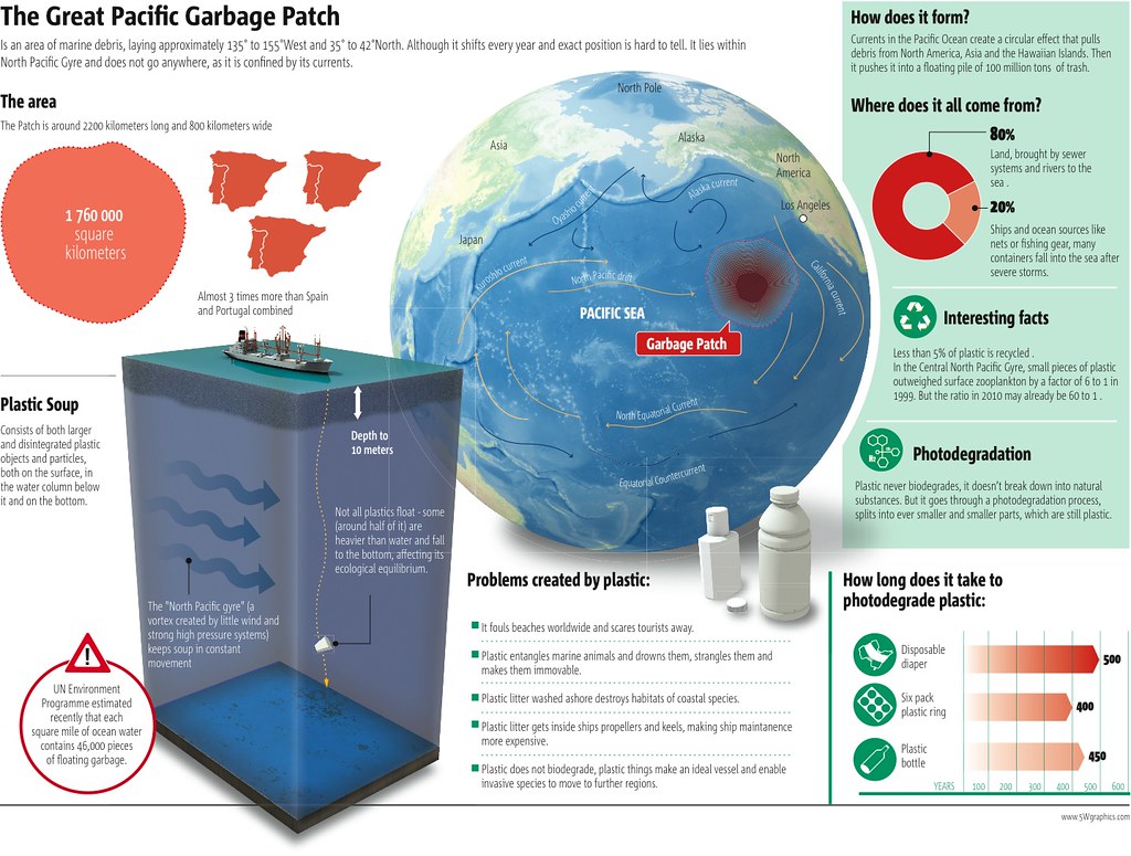
a. What went well?
a. What went well?
i think that me and my group members did a fine job of working together and collabrating. i like how we were real on point with meeting the dead line for things. everyone completed their part just as they were supposed to. we also all had fun learning about the garbage patch.
b. What did not? the only thing that i didn't like was we waited
till like that last three or four days till it was due to get started so we were working harder than we needed to and if we would have stared when it was given then we would have not had that feeling but we did get it completed and sill did a good job so we were happy about that.
c. What would you do differently next time?
we would just start on time that way were not rushing and stressing.
Exxon-Valdez Oil Spill: Luna's Reflection
What went well?
I felt that all of us, as a group, were able to be flexible and listen to each others' opinions. We also did a lot of good research. I thought that our infographic had a lot of good information on it.
What did not?
Although we had a lot of ideas, we were not able to carry through with all of them. Mostly, this was because of some time management issues. We worked hard on the project every day during class, but did not work on it at home or outside of class.
What would you do differently next time?
I would put more time into the project outside of class. I would also try to incorporate more charts or graphs; we had text but no data representations.
How did you do for the 10 infographic tips:
I think that our group was most successful in being different (because our spiral with photos was a unique idea), being attractive (because our design was elegant in black and white!), and being accurate (because our information was spot-on).
I think we could have done a lot better in being visual (because, although we had photos, most of our info was text), being varies (because we just had text and photos), and being concise (because we had little paragraphs at the bottom).
I felt that all of us, as a group, were able to be flexible and listen to each others' opinions. We also did a lot of good research. I thought that our infographic had a lot of good information on it.
What did not?
Although we had a lot of ideas, we were not able to carry through with all of them. Mostly, this was because of some time management issues. We worked hard on the project every day during class, but did not work on it at home or outside of class.
What would you do differently next time?
I would put more time into the project outside of class. I would also try to incorporate more charts or graphs; we had text but no data representations.
How did you do for the 10 infographic tips:
I think that our group was most successful in being different (because our spiral with photos was a unique idea), being attractive (because our design was elegant in black and white!), and being accurate (because our information was spot-on).
I think we could have done a lot better in being visual (because, although we had photos, most of our info was text), being varies (because we just had text and photos), and being concise (because we had little paragraphs at the bottom).
Three Mile Island Nuclear Meltdown
What went well?
Our group worked really well together. We all did our share and kept our word during this project. There were no moments during the process where one person was holding the group up because of incomplete work. We all did research outside of class and we all produced quality work that resulted in a great poster.
What did not?
Honestly, I can not think of anything that did not go well. Although I ended up doing the actual construction of the poster visually, we all contributed and I did not mind to put in a little extra work out of class. We got our stuff done on time and did not have any issues.
What would you do differently next time?
Next time, I would spend more time trying to get the sizing of the text and pictures right. It was really difficult to visualize when putting together. Usually, an 8.5x11 piece of paper is simple to see printed because it is generally the size of our computer screen. When working with something feet long, it was much harder to actually think about how large each word would be. Next time, I would spend more time thinking about this so that it prints perfectly.
10 infographic tips
I think our group was very good at being concise; we spent a long time making sure our information was clear, to the point, and supported one idea the whole way through. As well as visual; we spent a long time making our chart visually appealing and using primary sources to make it further visual. We were different because we used a layout of a reactor and stars indicating faulty areas to represent what happened in the meltdown as well as using newspaper articles and comics from the time to help display the overall point. We were accurate by using all accurate information and using a layout of a reactor that has all to scale parts. This helped demonstrate how little or big each fault was to the machine. We were varied because we used a picture of the reactor as our background and used pictures and bubble to make it look interesting.
We could have worked harder at being 'smarter,' attractive, and creative because we used a lot of text in our infographic that could have been demonstrated in other ways. We also could have worked more at being transparent. Although we had many primary sources and took down all cites used, in the end we did not include this to our infographic because of lack of time to make proper citations.
Our group worked really well together. We all did our share and kept our word during this project. There were no moments during the process where one person was holding the group up because of incomplete work. We all did research outside of class and we all produced quality work that resulted in a great poster.
What did not?
Honestly, I can not think of anything that did not go well. Although I ended up doing the actual construction of the poster visually, we all contributed and I did not mind to put in a little extra work out of class. We got our stuff done on time and did not have any issues.
What would you do differently next time?
Next time, I would spend more time trying to get the sizing of the text and pictures right. It was really difficult to visualize when putting together. Usually, an 8.5x11 piece of paper is simple to see printed because it is generally the size of our computer screen. When working with something feet long, it was much harder to actually think about how large each word would be. Next time, I would spend more time thinking about this so that it prints perfectly.
10 infographic tips
I think our group was very good at being concise; we spent a long time making sure our information was clear, to the point, and supported one idea the whole way through. As well as visual; we spent a long time making our chart visually appealing and using primary sources to make it further visual. We were different because we used a layout of a reactor and stars indicating faulty areas to represent what happened in the meltdown as well as using newspaper articles and comics from the time to help display the overall point. We were accurate by using all accurate information and using a layout of a reactor that has all to scale parts. This helped demonstrate how little or big each fault was to the machine. We were varied because we used a picture of the reactor as our background and used pictures and bubble to make it look interesting.
We could have worked harder at being 'smarter,' attractive, and creative because we used a lot of text in our infographic that could have been demonstrated in other ways. We also could have worked more at being transparent. Although we had many primary sources and took down all cites used, in the end we did not include this to our infographic because of lack of time to make proper citations.
Exxon-Valdez Oil Spill
By: Alaya, Bach, Luna
Link to sources: click here.
Link to sources: click here.
